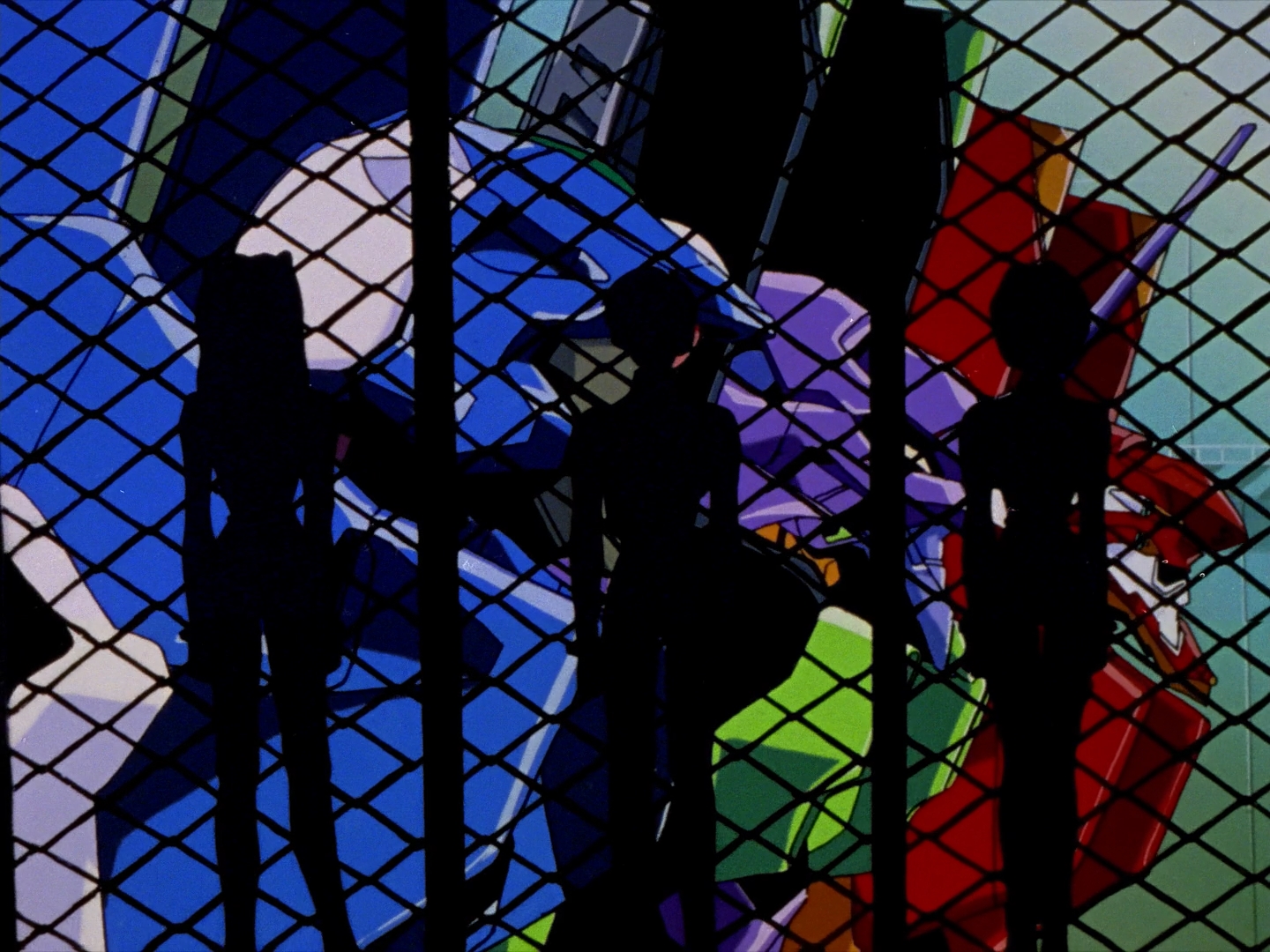
As much as any one show can, Evangelion seems to encompass what anime is. Towering mecha duking it out with even more massive monsters, cutesy animal mascots, catchy opening music, and two candidates for “best girl” that have engendered debates going on for two decades now.
But as the episodes go by, this begins to feel less and less true. Those marvels of mechanical might, the show’s “Eva,” are almost indescribably unsettling. The solid, purposeful movements of their super robot show forebears are replaced with agile, animalistic strides; metallic joints flex and tighten in supple, organic ways; and instead of serving solely as window to the pilot themselves, we see a robot that is alive with growls and groans and wounds that ooze and bleed.

The pilots, too, defy expectation. These are not plucky, self-assured heroes ready to save the world. They’re children, children who strive for the approval and affection of the adults around them, but find only demands and expectations in return. Anime-whipping-boy Shinji is often portrayed as a whiner by fans, but if anything, through most of the show’s run he readily submits himself to a job time and again that, rightly so, terrifies him—just so he achieve what he desires most: attention from his father.
Shinji is hardly alone in this regard. Asuka blusters and postures in an attempt to appear the self-sufficient adult in the face of a mother who abandoned her. Rei, who knows no life at all but to be used, struggles to understand relationships beyond the immutable tool dynamic forced upon her. Even characters like Misato and Ritsuko, full-grown adults, struggle with the remnants of their own childhoods and parental trauma and deal with it in flawed, self-destructive ways.
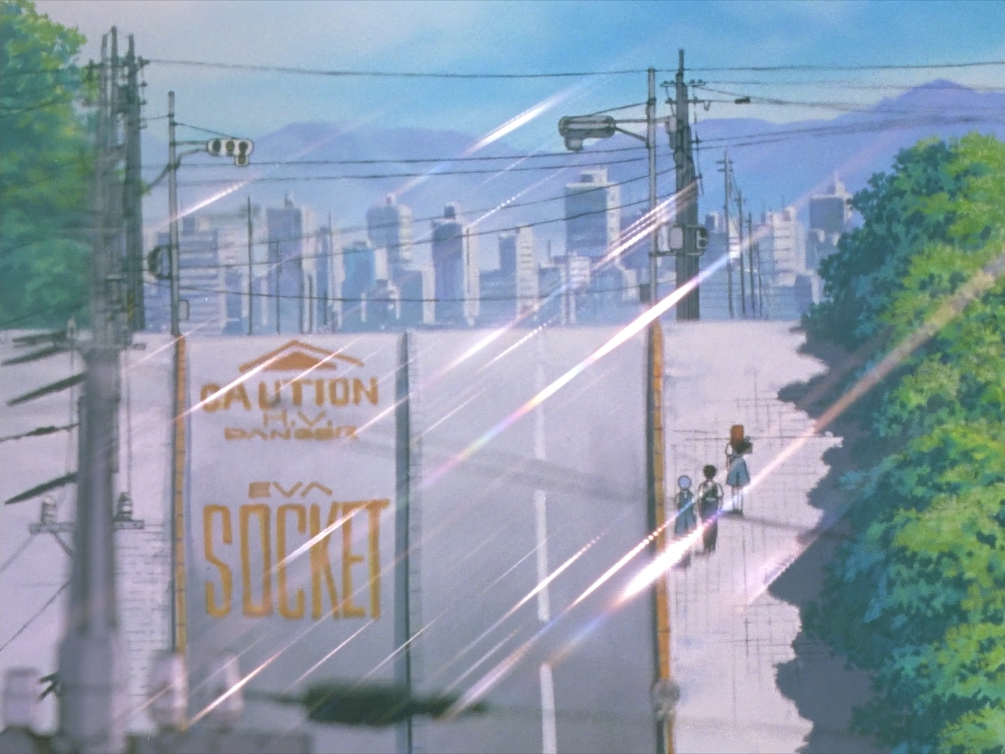
The show reveals this to us, little by little, in the guise of a monster-of-the-week show. An “Angel” shows up, bringing with it its own unique conundrum that must be solved before the episode’s end. Our youthful pilots are forced to confront their doubts and shortcomings, whether it’s Shinji’s trepidation about “getting in the robot”, his synchronizing with Asuka—and thus being forced to form an emotional connection with someone—in one of the series’ highlight episodes, or dealing with the inherent morality of being arbiters of life and death. As Evangelion goes through the motions of the genre it embodies, it deconstructs it in meaningful, interesting ways.
But no matter how many Angels there are to defeat, no matter how many tribulations must be triumphed over, what every character in the show wants, really, is to be loved—to be accepted for the flawed, broken people that they are. Even the infamous Gendo Ikari, for all his glasses flashing, finger temple-ing, abysmal parenting, is only seeking to recapture the love he has lost while failing completely to impart that same love to his son.

But as the show hurtles on to its conclusion, any semblance of careful pacing is thrown out the window. Gone are the bits and pieces of character development interspersed with tense action sequences and breath-catching moments of levity. Instead we are treated to diatribes of incomprehensible technobabble that, instead of buoying our characters’ development, threaten to overshadow them at every turn. The introduction of Kaoru, a seminal encounter in Shinji’s aspiration for acceptance, rushes through its character arc in a mere 25 minutes, something that could’ve lasted an entire season, and in doing so obliterates any chance to inspire the emotional connection it strives to impart.
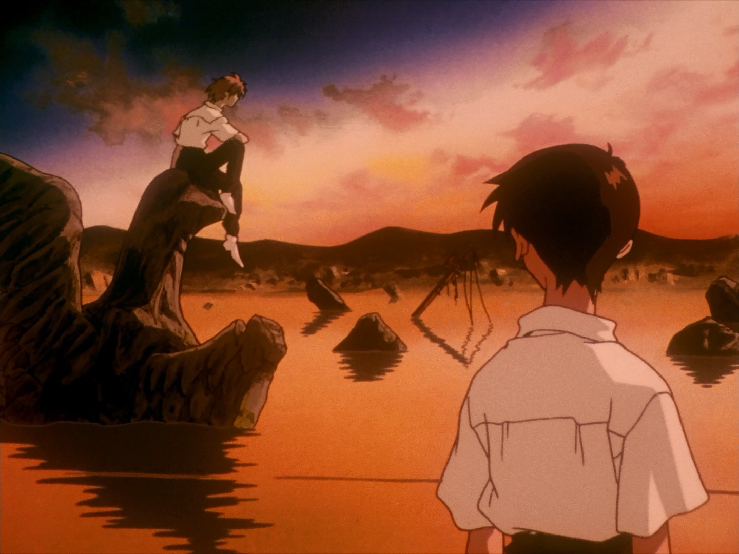
And then we find ourselves reaching Evangelion’s controversial climax—the ending the franchise has spent the better part of this millennium rewriting over and over. The truth of the matter is it’s not a bad ending at all. The entire show has been building up to this moment in Shinji’s life, this monologue of introspection where Shinji really has to deal with his anxiety and depression without hiding or running away.
But the moment is buried under baffling reused animation clips and the dangling questions of the shows’ own plot. What has been Seele’s goal all along? Gendo Ikari’s? What are the Dead Sea Scrolls? What were the Angels? What is this Human Instrumentality Project introduced in the show’s eleventh hour? It’s hard to cast blame for disliking an ending that feels so woefully incomplete. But if you’re willing to write away these questions as window dressing, or supplement your viewing with a bit of research, Eva’s ending encapsulates a complete catharsis of Shinji’s struggle—and as such is a much more satisfying ending that the more explicitly explained (yet somehow even more discombobulating) End of Evangelion.

But perhaps this incompleteness is as much a part of Evangelion’s enduring appeal as its memorable characters and awe-inspired designs. As the show takes its journey from sumptuously animated straight-up action romp to avant guard stream-of-consciousness introspection, there is a spot on this crazy train for everyone. And perhaps that’s why no single end-of-the-line is ever going to appease everyone. Like Shinji, perhaps Evangelion is something we simply ask too much from.
Perhaps that’s about as fitting a legacy as you’ll get.
Evangelion and OVA
Despite the length I go to demonstrate Eva’s super-robot trappings as a frame for a story about the human condition, inevitably the first question most people will ask about representing Eva in OVA is “How do we make the mecha go boom-boom?”
The answer is pretty straightforward. None of the Evas demonstrate any specific strengths or weaknesses, and even their armaments tend to be slave to the plot as opposed to anything concretely measured or differentiated. Just stat up capable combatants with decent points in “Attack” and you’ll be hard-pressed to go wrong.
What Evangelion does bring to the table that’s inherently interesting is the Eva units almost complete lack of a self-sustaining power-source. Without being literally plugged in, Evas run out of juice within minutes. It’s a fascinating wrinkle to the Angel-fighting hijinks, and one that immediately sets Evangelion apart from other giant robot-style shows.
Racing Against the Clock

Time is relatively abstract in OVA. You won’t find passages in the text extolling that a round is ten seconds long, or that a given action chips off a discrete amount of time from a hypothetical clock. For most narrative purposes, this works just fine.
But sometimes time matters—really matters. Evangelion drives this concept home when the Evas become separated from a dedicated power source. Whether due to severed plugs, long-distance deployment, or enemy interference, as much as the Angels themselves, time is the enemy.
That’s not to say one should adopt the ten-second round or anything so pedantically concrete. Despite the explicitly defined “five minutes” of the show, the narrative beats stretch and contract to fit whatever the plot demands. It is a constraint, but an elastic one.
So instead of setting a real-world time frame, it’s more prudent to simply assign a number of “Beats.” 10 is a decent amount, but this can be expanded or reduced as the Game Master sees fit. Likewise, the Game Master can increment the clock at any time. You could do this once a round, but also consider the narrative flow of the story:
- A character completes an action that takes a step towards a goal—or prevents another from completing their own.
- A character has dealt or received a significant chunk of damage. (Ie. by inflicting/incurring the zero Health Penalty.)
- An NPC provides useful information that contributes to the current conflict.
Also certain rolls will affect the spending of Beats.
- If a character has an Amazing Success, or inflicts a complication, that action will never spend a Beat.
- If a character fails an action of importance, it will always spend a Beat. (Missing in Combat does not count.)
But the flow of time is not solely at the Game Master’s discretion or the whim of the dice. The Players can use time to their advantage, or expend more of themselves to get the job done a little faster.
- A character may spend Drama Dice (or incur a –1 Penalty) to buy off a Beat that would ordinarily be spent.
- A character may get a Drama die by spending an extra Beat.
Obviously when there are no more Beats, time has run out! Hopefully the PCs have plenty of Endurance to burn to keep that from happening!
…By the by, that whole “best girl” thing I mentioned earlier? There’s only one right answer.
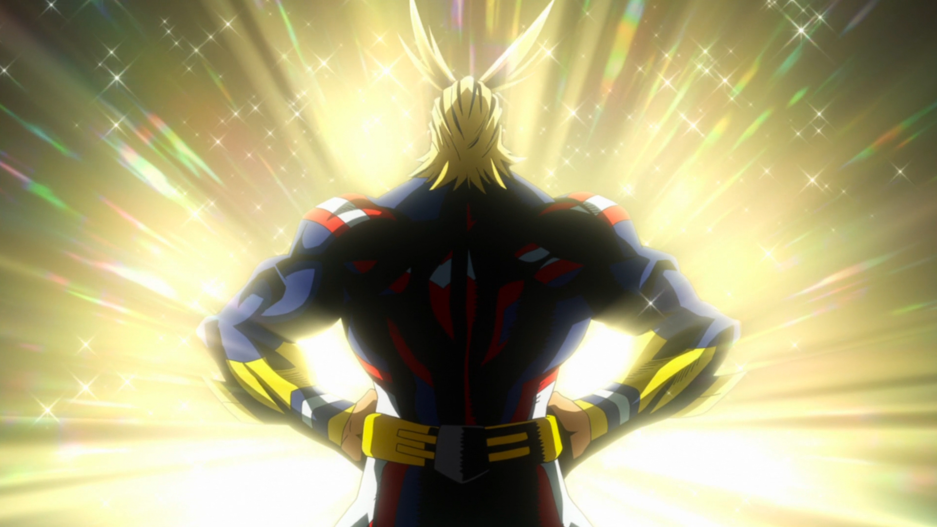 But don’t be fooled for a moment, as it’s still a very Japanese show. The main cast attend a superhero school (because of course they do), and our protagonist, Midoriya “Deku” Izuku is set to follow the ever-popular zero-to-hero shounen journey. In a world where 80% of the population is born with a “quirk,” the show’s name for super powers, Deku is forced to face that he, no matter how much he strives to be a super hero like his idol All Might, cannot overcome the immutable fact that he has no quirk to call his own.
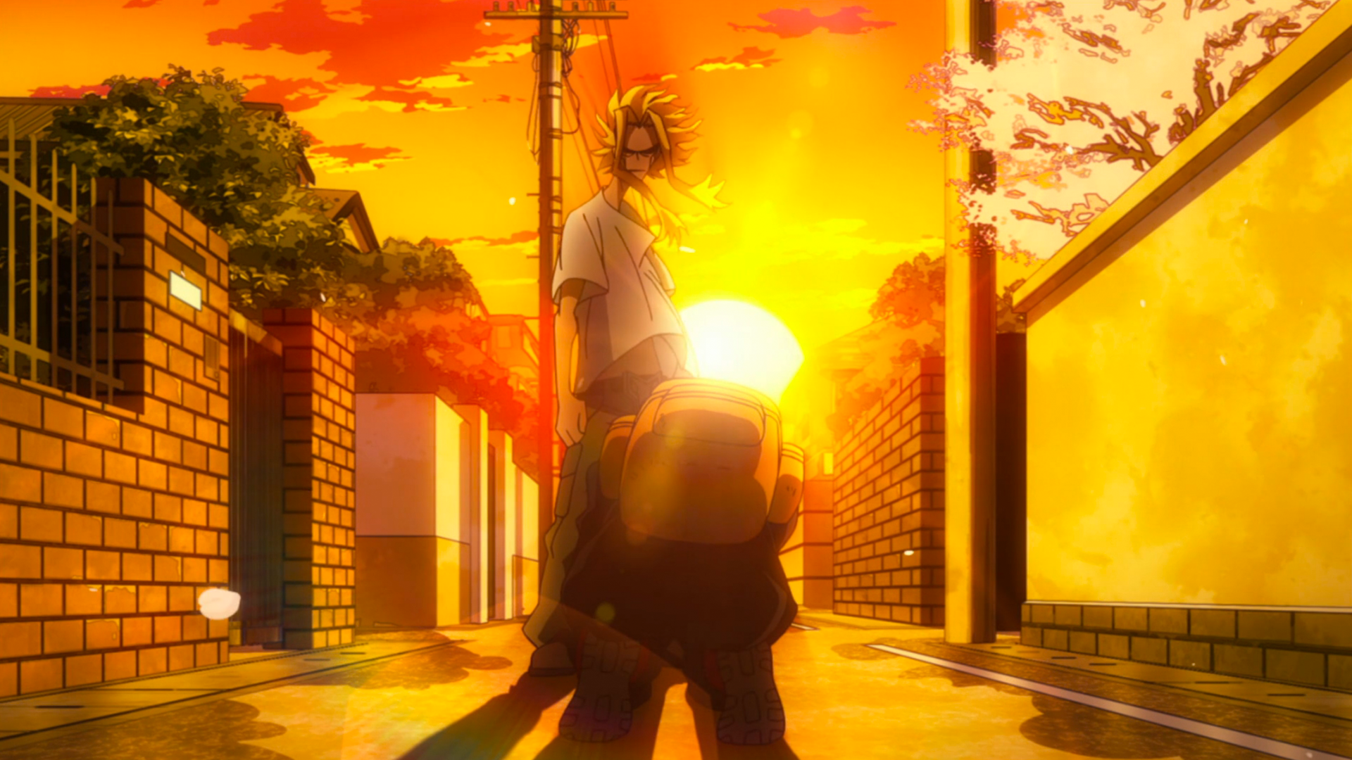 Honestly, I was half-disappointed by this. I saw in Midoriya’s first “battle” the potential for something unique, a shounen show that bucked the “blessed golden child with the ultimate power” in favor of Deku, a selfless, caring boy who would somehow make it through by his wits alone, using his encyclopedic knowledge to overcome his lack of a quirk and become a hero despite it all. When All Might passed on a small piece of his power, I crossed my fingers for it to be a sort of Dumbo’s feather.
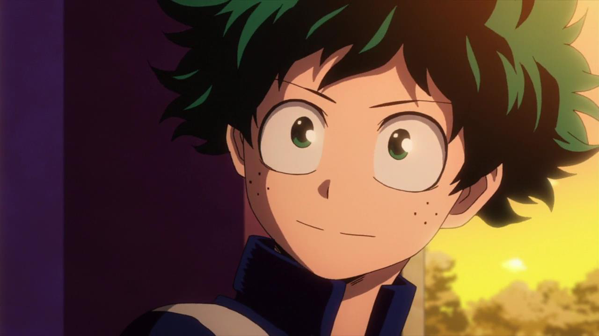 That’s pretty fitting, since I think there’s good argument that Deku did have a quirk: the ability to pour forth obscene amounts of bodily fluids out of his face.
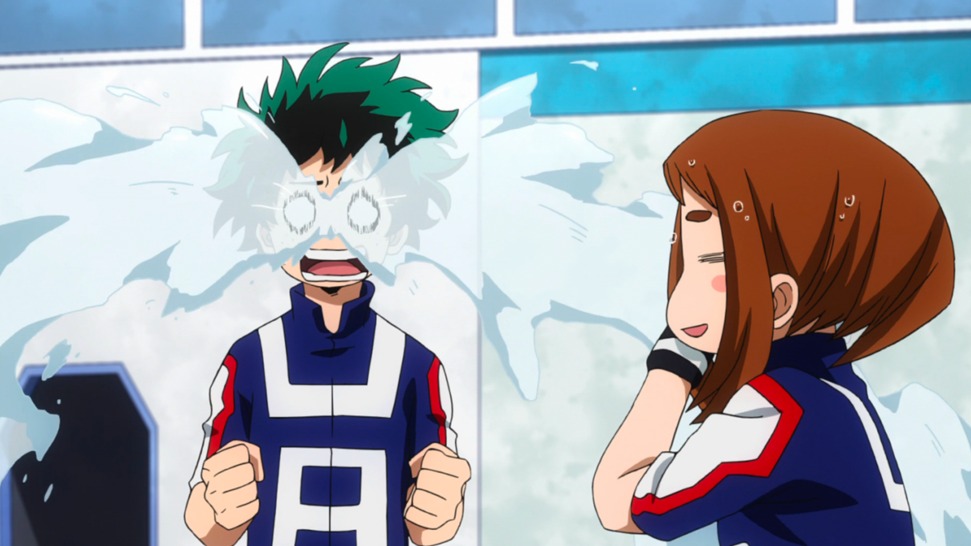 But Deku is just one part of My Hero Academia. I think what is actually one of the most fascinating things about the show is how the main characters work together. Hero teamups—heck, superhero teamups, are hardly a new concept, but whereas it’s typically just a merry-go-round of characters showing off their expertise, My Hero Academia really highlights the students using their quirks in creative ways to overcome each other’s weaknesses and maximize their potential. Whether it’s Yaoyorizu using her “Creation” quirk to create a electric proof barrier so Kaminari can shock the field, or Todoroki cooling off Iida’s overheated engine exhausts so he can wrench out just a little more power, watching these young heroes triumph in the face of adversity is a joy to watch.
 If there were a criticism I’d level at My Hero Academia, it’s that there’s some serious body horror going on. Whether it’s Iida’s aforementioned exhaust pipes jutting unnaturally out of his calves, Hanta ejecting tape from his elbows, or just Midoriya’s penchant for flying through the air with multiple limbs broken and flailing, I can’t help but continuously be a little squicked out as I watch.
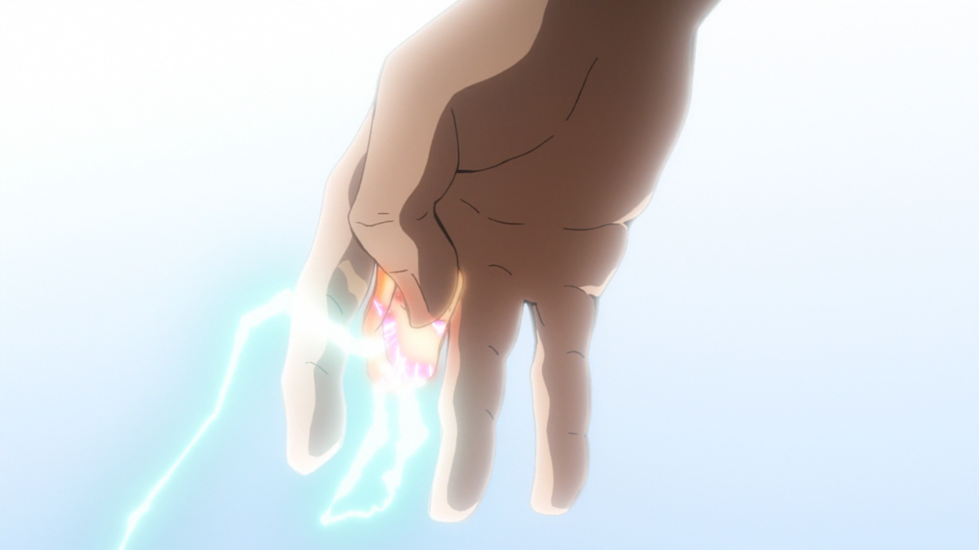 One For All (Midoriya)—Few things compare to the sheer power behind One For All. Wielded by All Might, it’s a strength so powerful that seemingly no enemy can withstand it, and even simple feats like jumping appear more like flying. However, in the hands of an inexperienced youth like Midoriya, it is an unwieldy, dangerous power—one that’s as likely to hurt the user as it is to accomplish its goals. When a character activates One For All, they must make a roll using their One For All dice and compare it a DN based on the Bonus they wish to receive.
 Explosion (Bakugo)—The Explosion quirk is a fairly straightforward damage-dealing ability best represented with a suite of attacks, . However, creative use of these explosions can allow for increased Quickness and even something akin to Flight, so including these Abilities would be appropriate.
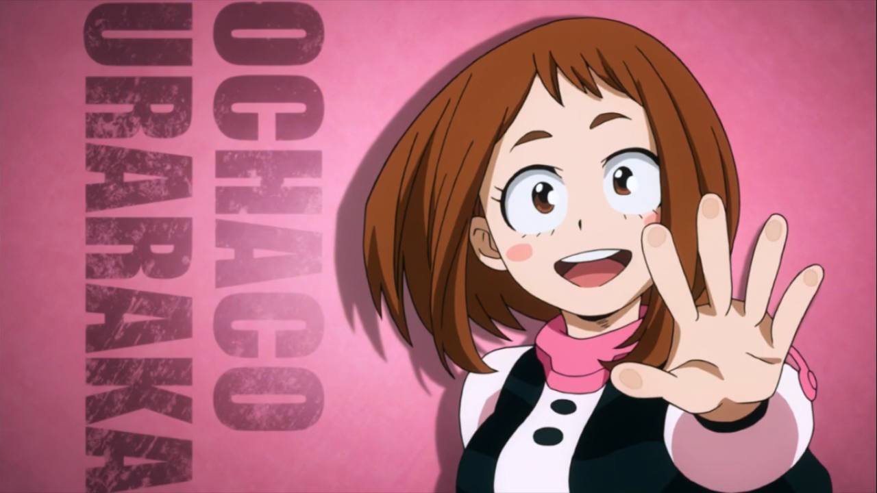 Zero Gravity (Uraraka)—Zero Gravity is effectively the Telekinesis Ability with the following limitations: A character must touch the object before it can be manipulated, and any objects of 12 or higher difficulty will cause the user to become nauseated soon afterwards. A character suffering from Zero Gravity induced nausea may take no Actions next turn, not even Defense Rolls, while they recover.
 Engine (Iida)—Characters with this Quirk receive a Bonus to all tests of speed equal to their Level in Engine. In addition, through the Recipro Burst maneuver, a character may receive double this Bonus for the next two rounds. However, this comes at the cost of not being able to use the Quirk at all for a significant amount of time. (Usually for the rest of the encounter, but this is ultimately left to the Game Master’s discretion.)
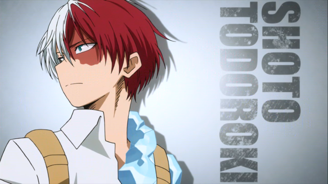 Hot & Cold (Todoroki)—Whereas most heroes’ quirks tend to be rather focused, Todoroki’s hot and cold halves give him a pretty versatile moveset. At the forefront is the sheer power of his attacks, so giving him high Levels in Attack is a must. (Don’t forget to include Affinities for Hot AND cold!) His ice side can also be creatively used as a Barrier.
 Frog Form (Asui)—While it might be tempting to assign a bunch of custom Abilities to represent various frog powers of leaping and tongue swinging, you can really cover both with elevated levels of Agile and Quick. Including an attack with the Paralyzing Perk and Ineffective or No Damage Flaws for more offensive uses of her tongue is also a good idea. And Ranged. Lots and lots of Ranged. Camouflage is easily covered by Art of Invisibility or even full-on Invisibility.
 Creation (Yaoyorozu)—The Creation Quirk works similarly to Dimensional Pocket (p. 52 of OVA). However, difficulty—instead of being based on usefulness—is based on the size of the item being created, and instead of rolling against a Difficulty Number, more difficult items simply take longer to create.
 Hardening (Kirishima)—One’s first impulse may be to represent this quirk with Armored, and that would work fine. But I think using Barrier is a better fit for two reasons: 1) Hardening is almost always shown as completely negating Damage, which only Barrier can do reliably, and 2) Hardening grows less effective over time. This can easily be representing by having less and less Endurance to spend on nullifying damage.
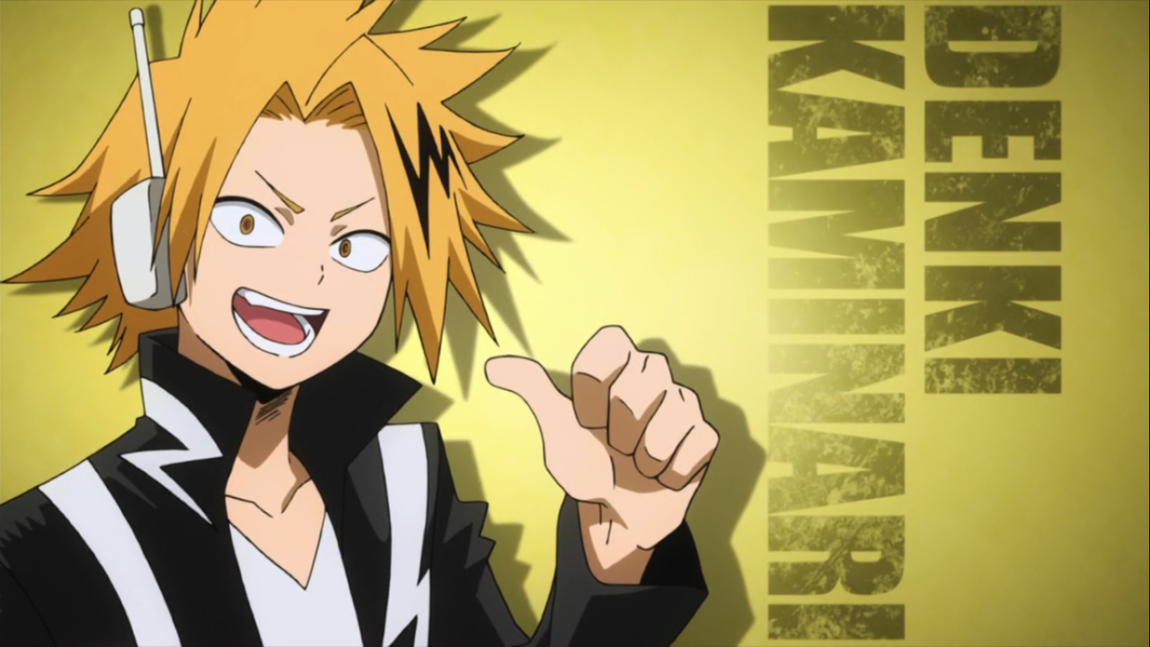 Electrification (Kaminari)—Some heavy doses of Area Effect and Effective combined with Cancel (Non-Conductive Objects) and a special Flaw of short-circuiting the brain will result in suitably shocking Ability.
 Invisibility (Hagakure)
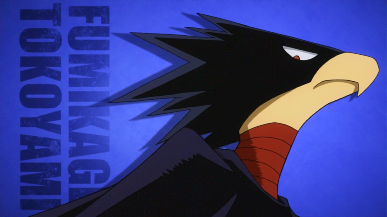 Dark Shadow (Tokoyami)—Dark Shadow is a powerful, versatile quirk that’s not terribly well-defined in what it can and can’t do. In general, a character with this quirk has great offensive and defensive capabilities, and the fact that it is the “Dark Shadow” doing the work can be written off as flavor as opposed to being individually represented as a “power.”
 Pop Off (Mineta)—Oh Mineta—to be honest, you could probably just handwave all of Mineta’s “powers” since he’s played up almost entirely for comic relief. But if you want, you could make a suite of Attacks using Perks like Impairing and Paralyzingbut the No Damage Flaw. Trap is another great consideration.

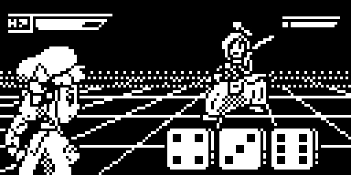
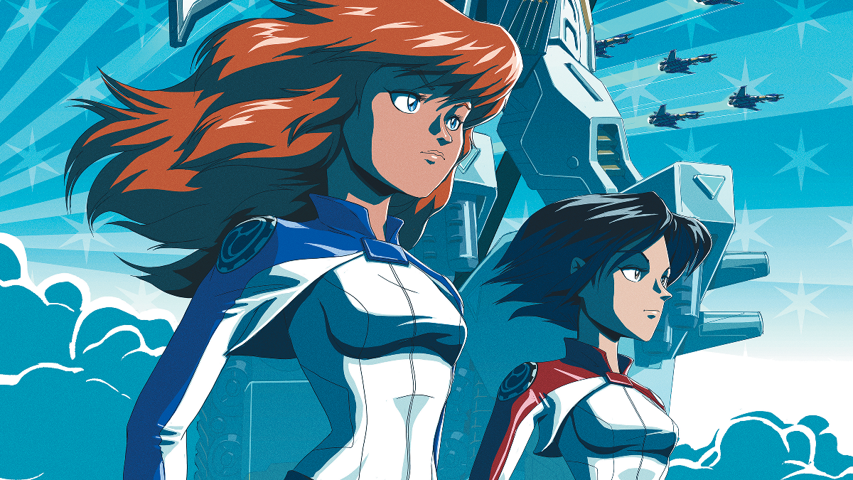
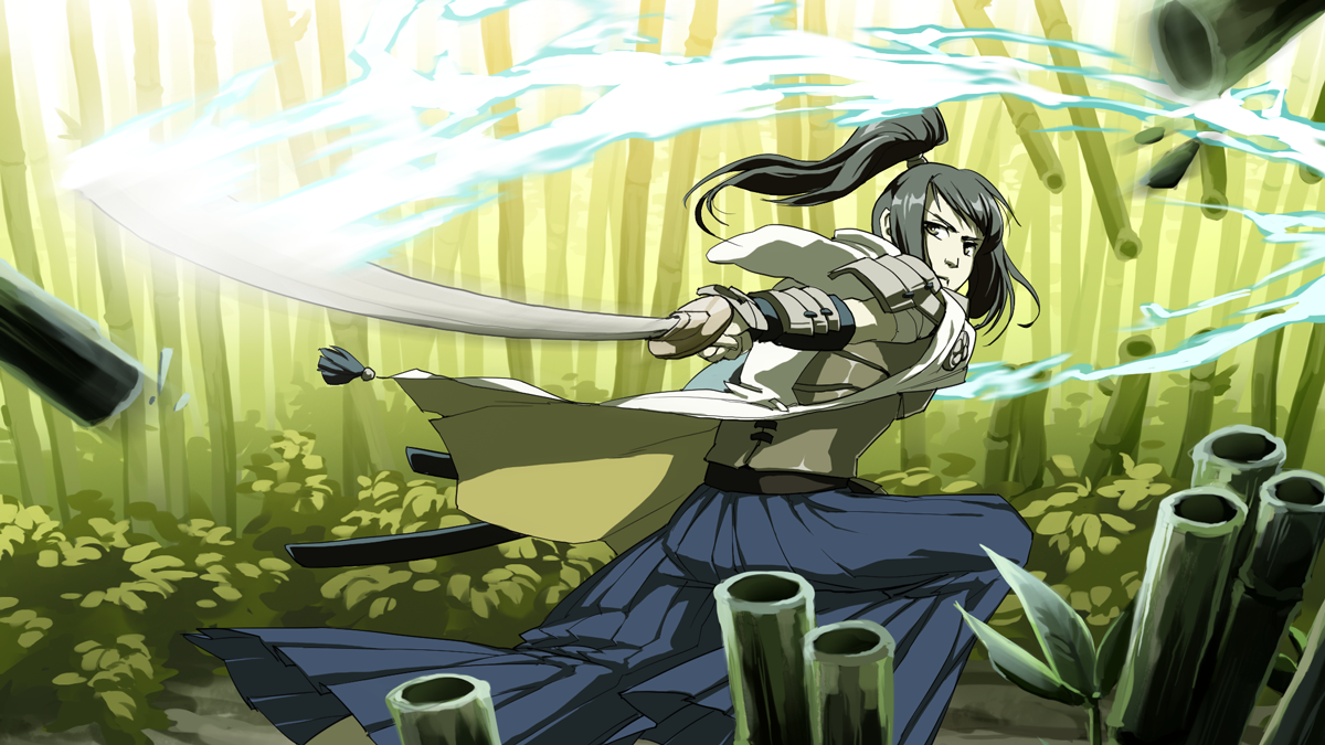
 But Spike isn’t just sort of good at both, he’s great. And if you couldn’t create Spike with ease in OVA, then that’s as much of a litmus test as anything. With that in mind, I condensed every combat skill into an Ability called, well, Combat Skill. With one attribute, your character was adept at attacking, whatever form that takes. Sure, it flies in the face of most RPG design that routinely compartmentalize such things, but it just made things so much easier. You could still just do one thing, of course, but if you ever wanted to branch out, you weren’t punished for it.
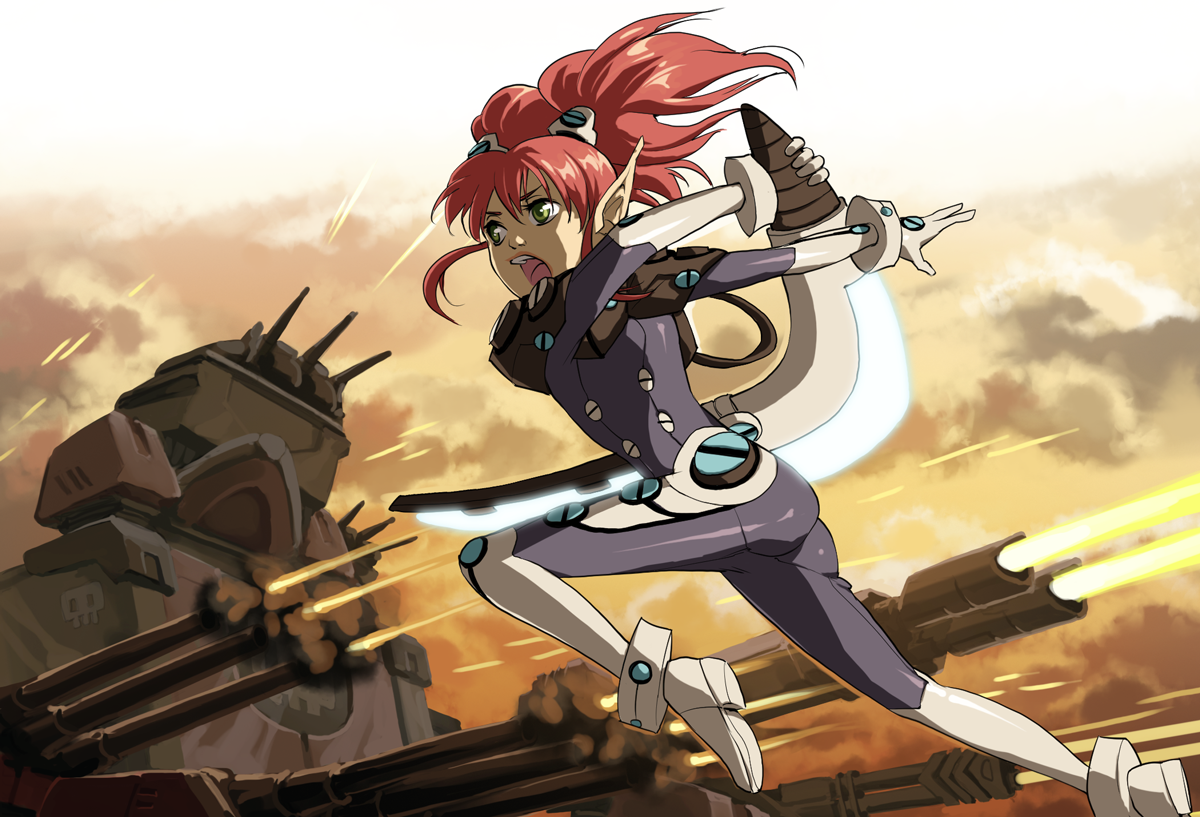 While this was easily the most gratifying change to OVA, there’s a vast variety of additions and improvements that I’m also fond of. The original game’s “knockback” was split into three separate combat complications, giving more tactical options to the otherwise streamlined rules. Looking at these, I realized that I could take the same concept and apply them outside of combat, and Succeeding with Complications was born. While I won’t be foolhardy enough to claim this is an entirely new idea (Fate, if nothing else, pushes the “fail forward” concept hard), I’m really please with how neatly it fits into OVA and brings combat and out-of-combat closer together thematically.
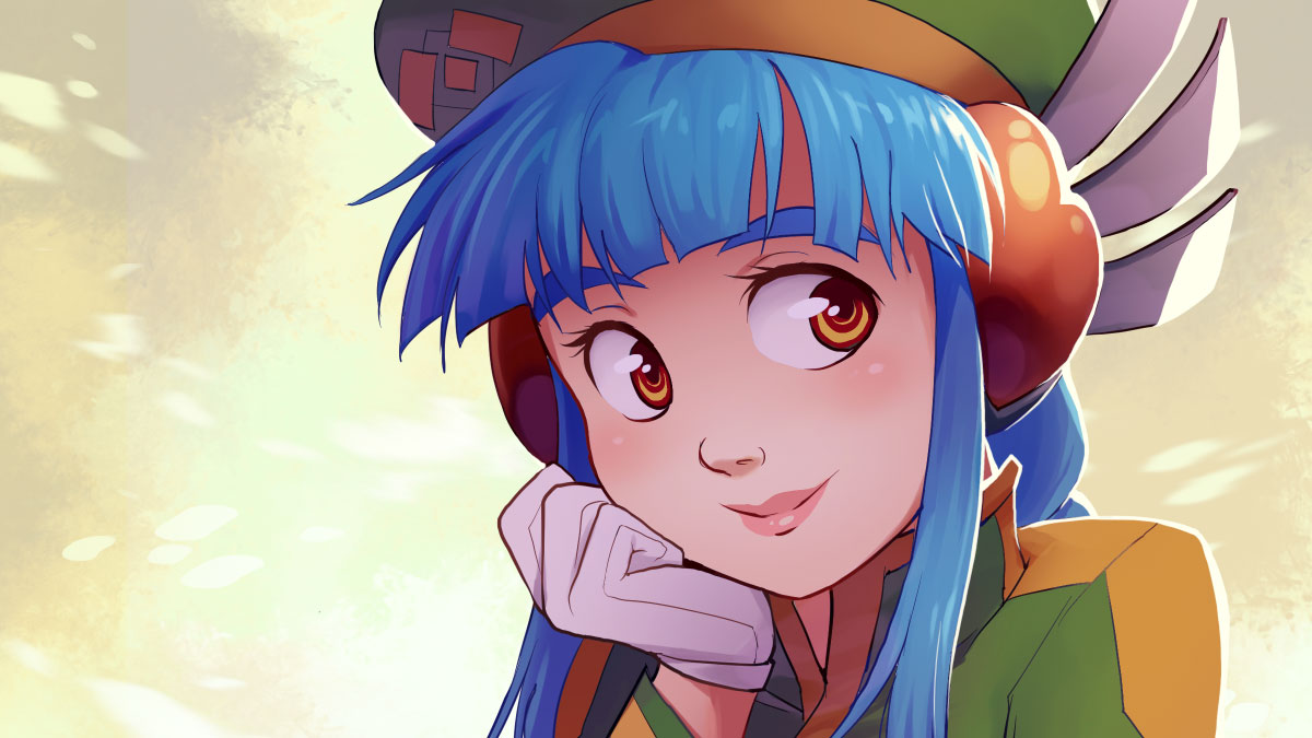
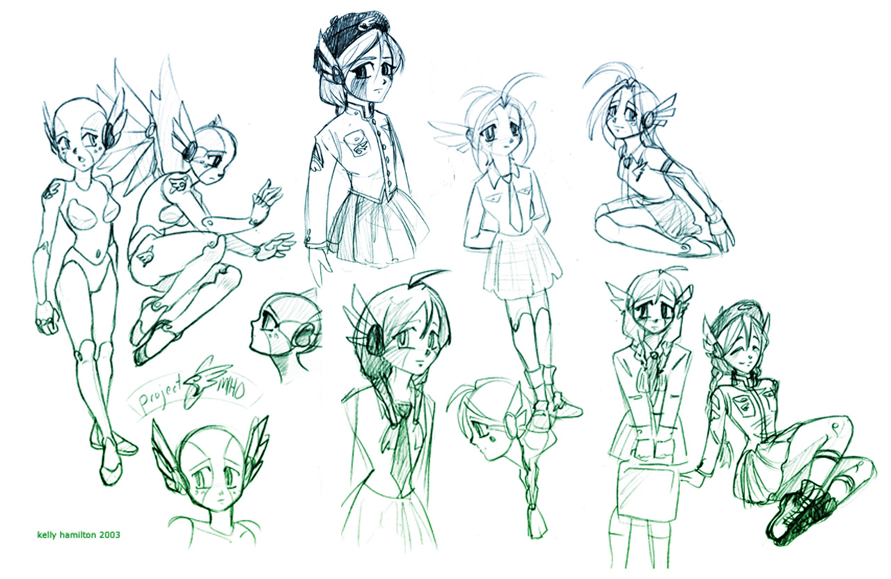 The military-inspired uniform makes its first appearance here and was used for her final design. This iconic ensemble would go on to be featured (more or less) in the revised game, despite the fact that most other character designs changed completely.
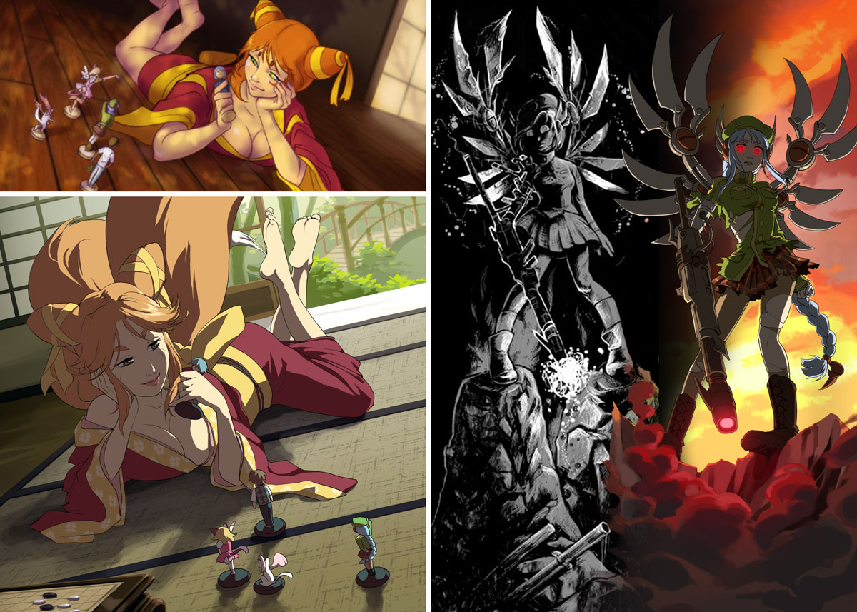 Oh, and if you’re wondering about my illustrations mentioned earlier, here’s a final comparison featuring everyone’s favorite copper, Jiro.
 Slight improvement, right?
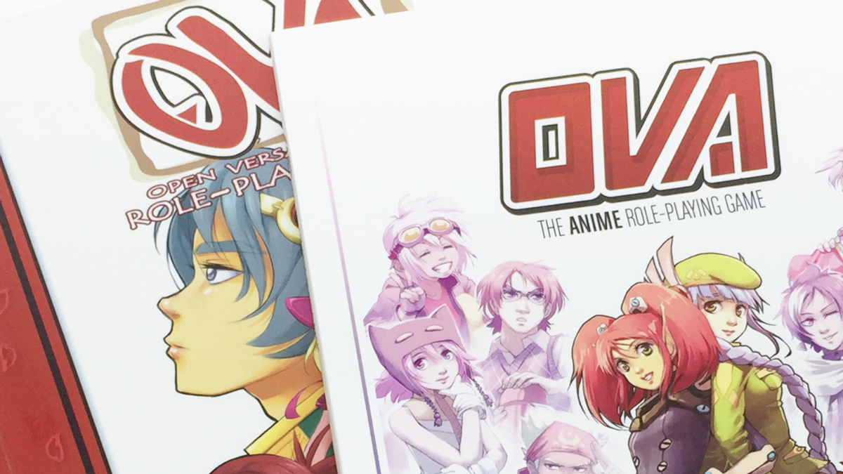
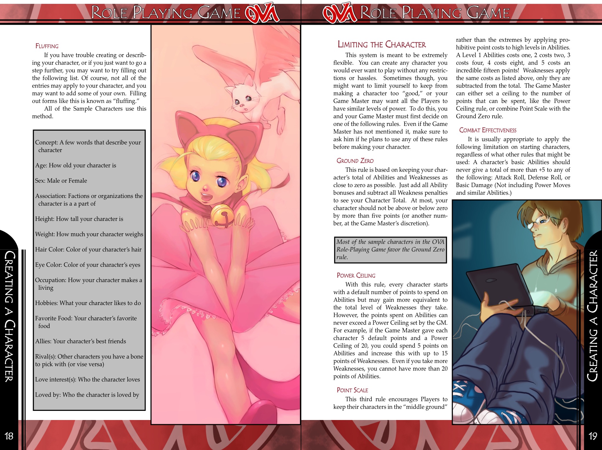
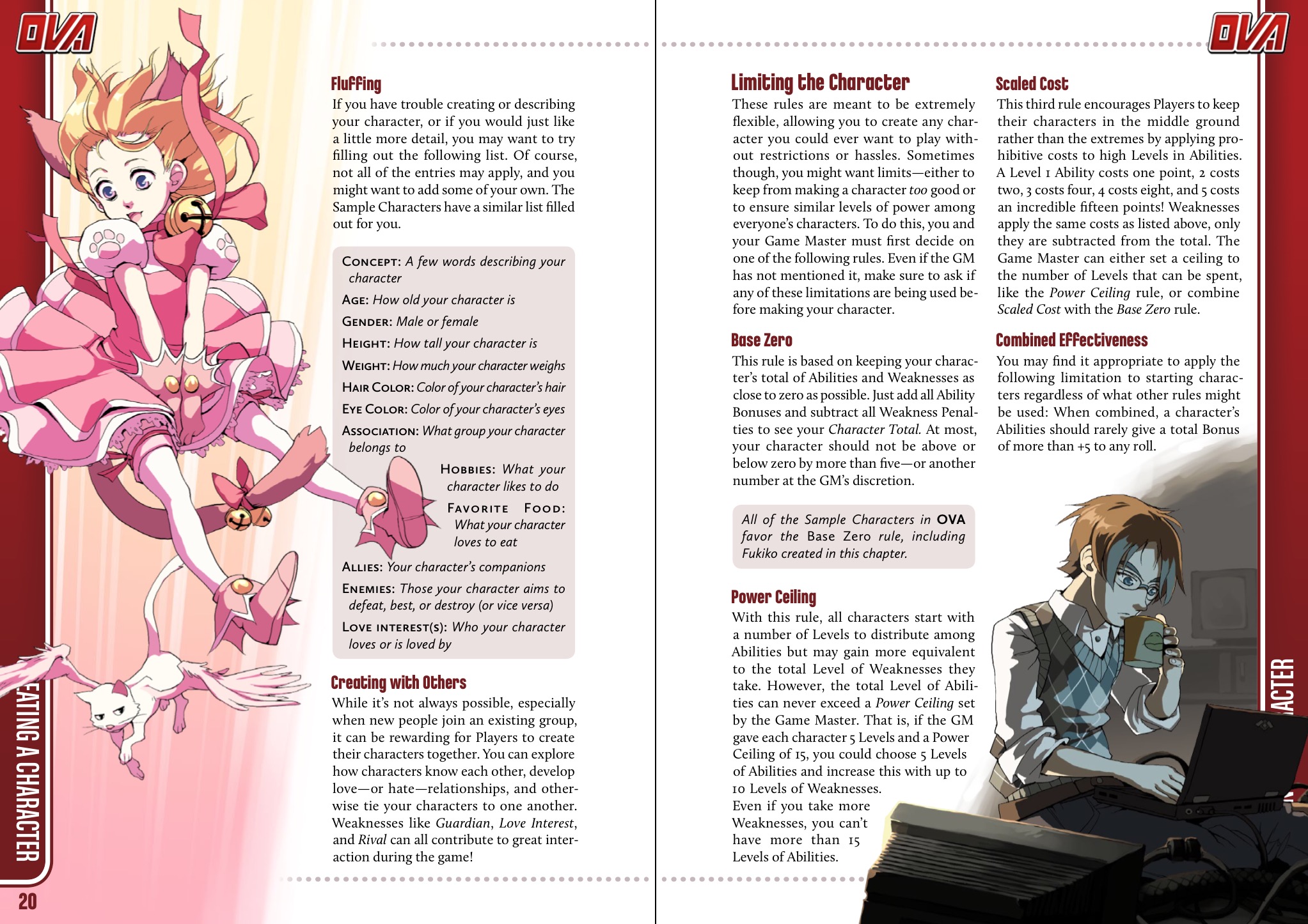 I chose this set of pages because it’s one of the few spreads that remained effectively identical between the versions with text and art placement. I think it demonstrates the difference a bit of experience makes pretty well! There are a lot of things I could point out, but here are some of the biggest points of advice I can share.