It’s been eleven years since I released OVA. More than a decade. It’s a span of time that simultaneously feels endlessly long and impossibly short. It’s a time in which things have changed. RPG PDFs, once a niche undertaking that only some took advantage of, are now the type of product almost every serious RPG maker releases. These same PDFs exist not on just computers, but on incredible machines touted about in pockets and backpacks, portable digital libraries that were the stuff of science fiction when OVA first came out. These same devices connect us more than ever before, with more ways to share, reshare, and discover. We consume media differently, with the very anime OVA is inspired by available at the click of a button and ready to watch any time, anywhere.
I’m different too. A little older of course, but hopefully a little wiser and a little more adept at making these curious games called RPGs. It’s this accumulation of knowledge that helped make the new revised edition of OVA possible. I’ve learned a lot in these years, and I put every bit of it into the game. So the passing of yet another anniversary seemed as good an excuse as any to visit the differences between the book I made then and the one available now. So here is my three-part look at OVA, old and new! First up, let’s look at the graphic design.
When I created the original OVA, I was not a graphic designer. I always had an interest in it; countless hours spent collecting fonts, designing character sheets, and a few too many greeting cards created in Print Shop Deluxe were testament enough to that. But it wasn’t something I was really cognizant of being a thing. Yet I knew there was more to making a book than typing into Microsoft Word a coherent series of thoughts and hoping for the best. I taught myself about layouts and dpis, of leading and bleed, and the Byzantine puzzles that made up Quark, and somehow made it happen.
Since then, I’ve abandoned Quark for InDesign, and at least partially mastered its own idiosyncrasies. I have been a part of dozens of books, board games, and other projects. Put succinctly, I got better. What did that mean for the new version of OVA? Let’s take a look by comparing a spread from both versions.
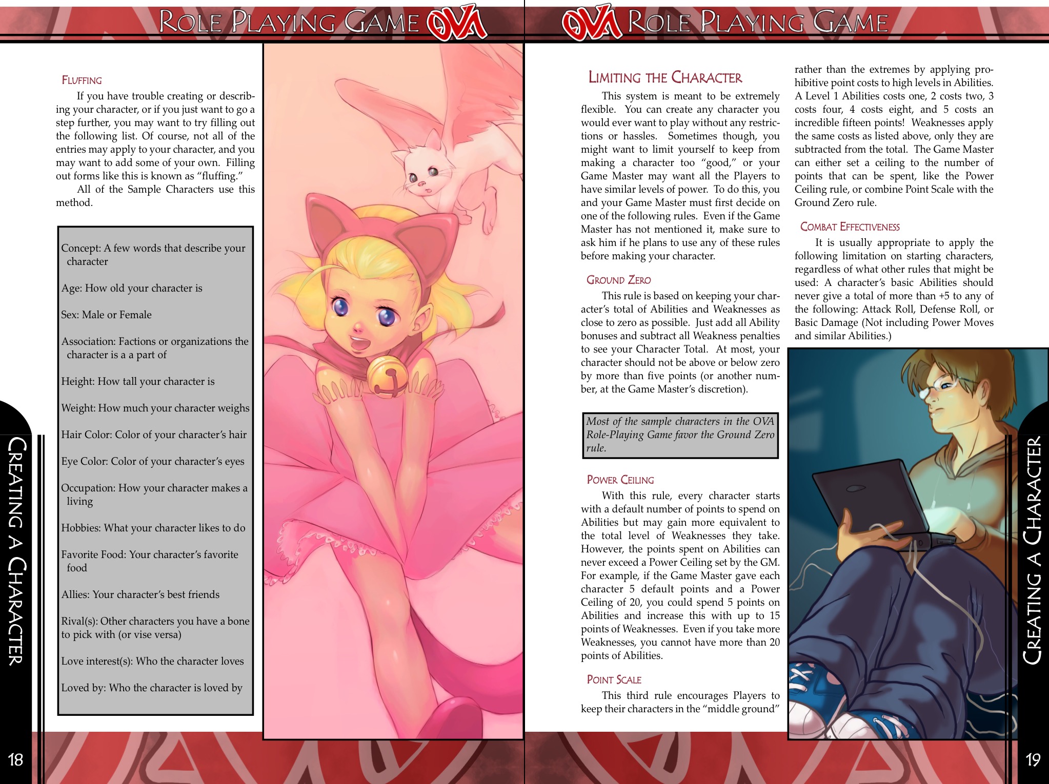
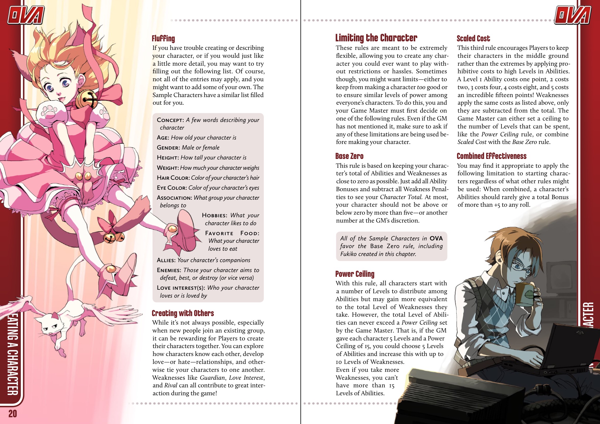 I chose this set of pages because it’s one of the few spreads that remained effectively identical between the versions with text and art placement. I think it demonstrates the difference a bit of experience makes pretty well! There are a lot of things I could point out, but here are some of the biggest points of advice I can share.
Give the Layout Room to Breathe
If you look in the original book, the text is butted up to the edge of pretty much everything. The text in the note boxes practically touch the black outline of its container. Even outside of these constraints, you’ll see text struggle against large areas of artwork, almost dwarfed entirely by the sheer proximity. Economy is taught as a virtue, but for the sake of a pleasant reading experience, don’t be afraid to give the text a little room to breathe. If you plan for your book to appear in print, that means giving it some birth in the center margin as well, just so it’s not lost in the spine of your book.
It’s also okay for some areas of the page to just be blank. In the old design, almost every square inch of the page has some graphical element. Again, the idea that “more is better and nothing is bad” is a phallacy you should take out of your design vocabulary right away. Compare to the new header and footer, blank except for a dotted line. (Trivia: InDesign refers to this particular dot size/pattern as “Japanese Dots.” Pretty apropos, right?)
Treat the Text with Respect
Just like arranging the elements of a page is more than just slapping words together, rendering the text itself is something that deserves your consideration. Taking the time to learn a bit about good typography is a subtle but indispensable tool in your arsenal if you plan to typeset your own books. There are lots of great books on the subject (including Robert Bringhurst’s classic, and software independent, Elements of Typographic Style), but here’s a quick and dirty list of some of the most important things I’ve learned over the years. Just do me a favor and don’t point out how many of these mistakes appear in the old book!
- Excise bad typographical habits. We’ve all heard things like “double-space after periods.” …Don’t do it. It’s a throwback to the days of the typewriter and has no place in your manuscript. Likewise, replace trios of periods with proper ellipsis characters (. . . vs. …), and learn the difference between the various dashes. A hyphen is not a catch-all, and using “- -” in place of the appropriate dash is sloppy. And for those of you who use measurements in your games, the feet and inch marks are primes (″), not quotes (”).
- Oh, you don’t want to google about dashes? To quickly summarize, a hyphen is the shortest (-), and the mark you’re most used to making. Its only use is compound words and breaking words at the end of lines in justified text. The en dash is debatably the width of an n (–), and should be used to indicate ranges of figures (2–4 oatmeal cookies). It also works as a minus sign before negative numbers (–2), thought technically there’s a dedicated symbol for that purpose if you want to get really nitpicky. Finally, the em dash is the longest (—). Use it for abrupt changes of thought—is anyone still reading this?—and for attributions. You can also use an en dash for changes of thought, but it needs spaces around – whereas the em dash does not.
- Make sure your lines are not too long or too short. The optimal number of characters is around 60-70 per line (including spaces), but you can swing as low as 40 and as high as 85 or so. The “Word Document” effect, where you just throw text full-width on letter-sized pages is both terribly unprofessional and just plain trying to read. Also consider increasing the leading (gap between lines) for longer lines to improve readability.
- Don’t indent the first paragraph of a section. It’s unnecessary and tends to look choppy after headings, which RPGs love to use a lot of.
- Don’t just use a series of carriage returns to separate lines. If you have a list of items in a row, consider bullet points or increased leading between the lines. Full line skips feels gappy at best and lazy at worst.
- Use proper italics. Good typefaces will have dedicated fonts to represent emphasis, with it usually taking a cursive-like appearance. It is not just the upright font slanted, which is a butchery that should be stopped.
- Don’t be afraid to mix serif (typefaces with little “feet” like Times New Roman) and sans serif (typefaces sans these feet like Helvetica/Arial). Used in a consistent manner, it can help give different types of text (like OVA’s note and example boxes) their own character and further individualize them from the surrounding text. While I stuck with serif for the body of OVA, it’s perfectly possible to set a book entirely in a sans serif typeface. Just print out a page and make sure it feels comfortable to read at length.
- If you use InDesign, turn on Optical Alignment in the Story panel. This allows punctuation and other small marks to hang outside the margin and give a much more pleasing edge to your paragraphs when justified. You can thank me later.
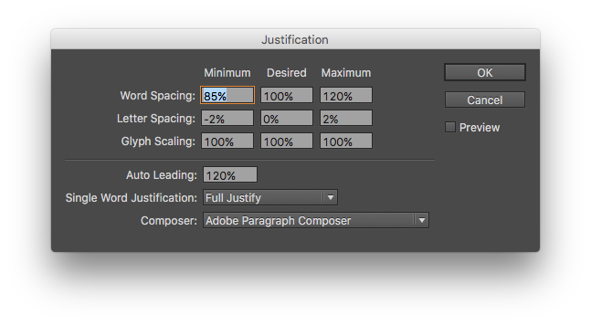
- Last but not least, customize your justification and hyphenation settings. Most of the settings out of the box just aren’t that great. I’ve included a screenshot of some of my preferred settings below. There are lots of great articles on what these numbers mean, but this should help you a bit.

Learn From the Best
While absorbing tips and guidelines is well and good, one of the main ways to improve your book layouts is by reading. Look at your favorite, most beautiful books. Study them. See what they did right. Don’t be afraid to look outside of RPGs for inspiration. Video game advertisements, cookbooks, and even that 99 cent app you downloaded yesterday can all feature valuable lessons in design. Just always keep your eyes open. OVA took a page from the manga that inspired it, adopting the A5 form factor over the more traditional 6″×9″.
That’s it for now. Come back next time for when I look at the evolution of OVA’s art and its characters.