It’ll come as no surprise that I love anime. I wrote the (RPG) book on it, after all, and my twitter feed full of anime-style artwork is verification enough. But at the same time, so much anime I watch feels like it has qualifiers, excuses that need to be made to fully and heart-feltly recommend. “This show is great if you don’t mind the fanservice,” or “You have to check your brain at the door, but it’s an amazing ride.” That’s not to diss these things, as sometimes you just want brainless fanservice action romps, and there’s nothing wrong with that.
But every once in a while, an anime like Erased comes along, and it really reminds me what a great show can be. A show that is good without any buts. A show that’s just good, really.
In Erased, Satoru is an aspiring manga artist and part-time pizza delivery man, seeming to rather listlessly make his way through life. But soon we discover that Satoru is far more than ordinary, as he possesses the strange ability he dubs “Revival.” When something horrible is about to occur, his body involuntarily jumps to moments before in time, giving him a second chance to notice what is awry and do his best to set it right.
 It’s an intriguing premise on its own, but when the death of someone close to Satoru results in him being framed for the crime, Revival kicks into overdrive and send him all the way back to 1988—to his childhood days where he and his classmates experience the abduction and death of fellow students. As an adult-minded Satoru relives his youth, he realizes that these murders may be the source of his misfortune in the present, perhaps the origin of everything, and he sets out to change the future.
If this power, this mystery, were the only things Erased had going for it, it would still be a great show. But every frame is brimming with tiny details. Cameras lovingly pan over home-cooked meals, shoes slipping off to reveal hole-y toed socks, and moths fluttering about electric lights. It’s easy to refer to these things, these vignettes into the everyday, as pleasing but unnecessary, but such words couldn’t be a bigger disservice. It’s these minutia that really bring home Satoru’s reliving of his past. As an adult, these things that are so fleeting and inconsequential to a child are so much more to his adult self, and Erased does well to give them this nostalgic gravitas.
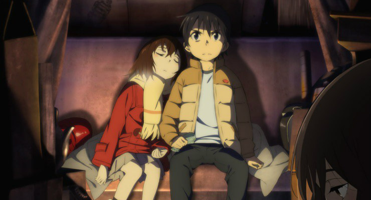
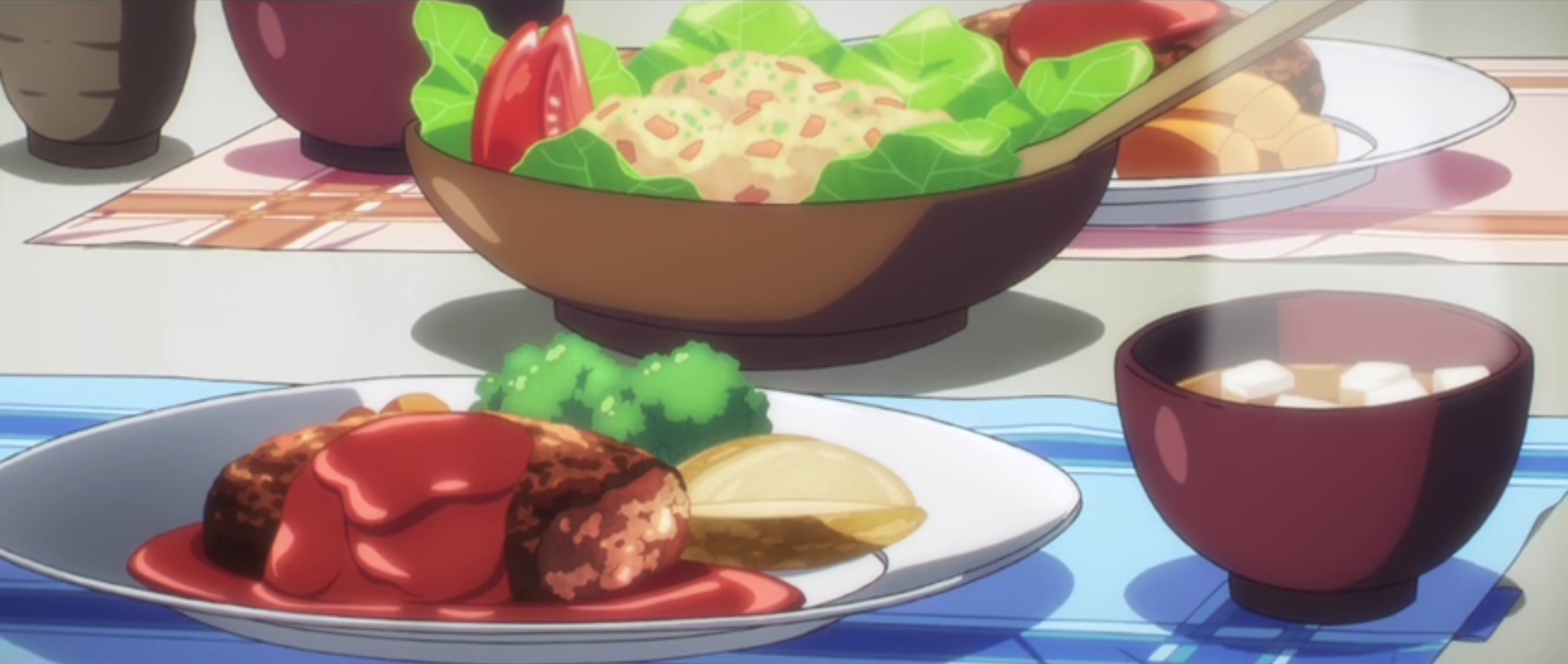 This especially true since Satoru’s success in changing the future has as much to do with changing his relationships in the past as it does his detective work. His efforts to keep Kayo, the serial killer’s first victim, from being vulnerable and alone develop into much more, as they each discover the truth in each other and the insecurities he didn’t fully understand as a child. It’s not just Kayo, either, as Satoru reaches out and makes deeper, more profound connections with his core circle of friends, eventually enlisting them on his quest to thwart the dismal future.
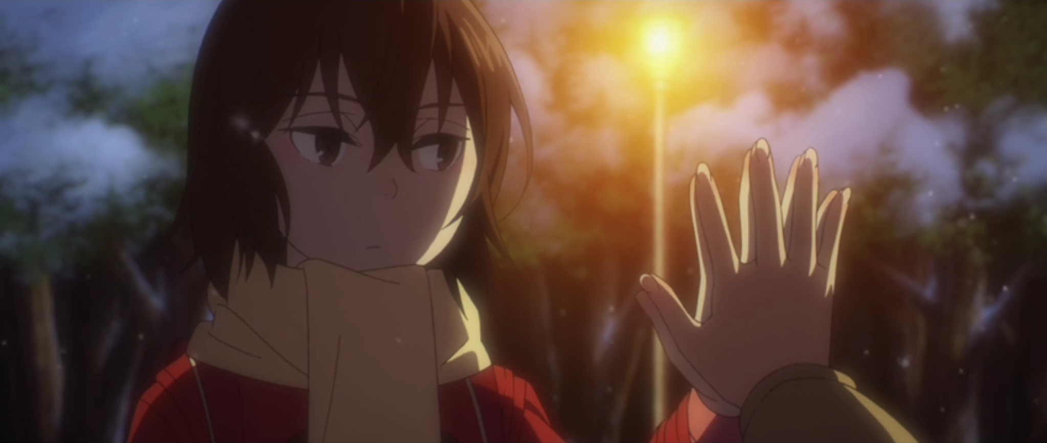 The show deftly juggles the murder mystery and everyday life, Satoru’s past and present, and spans of calm and drama in a way that neither ever outlives its welcome. It’s a mixture that thrives on each other, and the show’s pacing perfectly sets up the conclusion in a way that imminently satisfying. That’s not to say the show is without faults. One of the main antagonist’s characterization is embarrassingly thin; even the serial killer that serves as the catalyst for the entire story isn’t much better. But that’s okay, because the story isn’t really about them. It isn’t really even about the murder mystery. It’s about people treating each other with kindness, learning to see past the failings of ourselves and others, past the barriers we erect around us. And connect.
Because we don’t have to be alone.

Erased and OVA
Erased isn’t the sort of over-the-top high-octane show that lends itself to a bunch of new rules. The show is a framework to display, trite though it might sound, the power of friendship, and the best way to do that is load up your characters with Weaknesses that lend themselves to isolation and Abilities that they can use to help pull each other out of their self-imposed cages (or the cages imposed by others). Of course, there is one facet of Erased that begs to have a few rules applied to it, and that is Satoru’s “Revival.” Though later on it’s used almost solely as a plot device to send Satoru to his past, as presented in the early episodes, it’s the sort of Ability that could really find use in all kinds of adventurous campaigns.
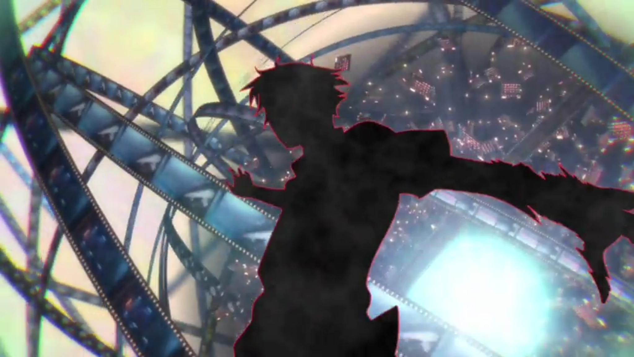 Revival—Time does not flow smoothly for you. When great misfortune, harm, or other danger happens around you, your life’s clock rewinds a few precious seconds, giving you a second chance to notice what has gone wrong. This awareness is not automatic, as you only know that you have jumped back into the past, not the exact reason for it. The greater your level in Revival, the more time your character rewinds backward, giving you longer to assess the situation and act upon it. Add your Revival Dice to any actions you manage to take during the span of time that you repeat. If you can’t discover the reason for the Revival (with Abilities like Perceptive or Sixth Sense) or act on them in time, the Revival and its Bonus dice end.
So that’s it for Erased! I plan to keep doing this for anime I watch, so let me know if you have a favorite you’d like to appear on the blog in the comments!
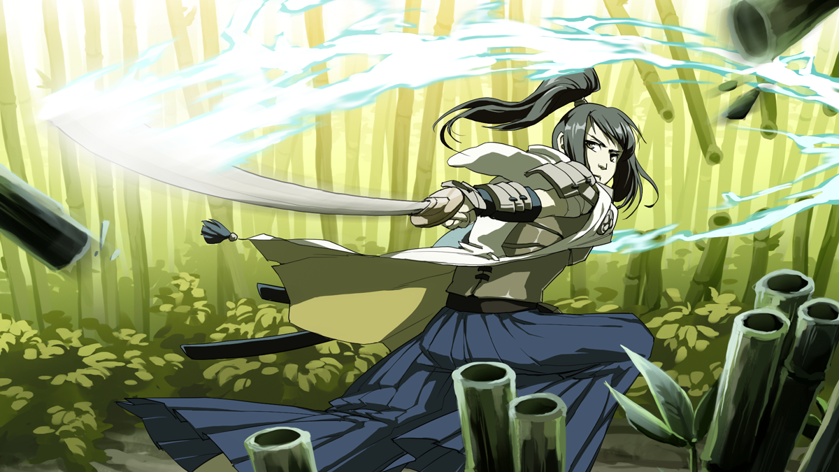
 But Spike isn’t just sort of good at both, he’s great. And if you couldn’t create Spike with ease in OVA, then that’s as much of a litmus test as anything. With that in mind, I condensed every combat skill into an Ability called, well, Combat Skill. With one attribute, your character was adept at attacking, whatever form that takes. Sure, it flies in the face of most RPG design that routinely compartmentalize such things, but it just made things so much easier. You could still just do one thing, of course, but if you ever wanted to branch out, you weren’t punished for it.
 While this was easily the most gratifying change to OVA, there’s a vast variety of additions and improvements that I’m also fond of. The original game’s “knockback” was split into three separate combat complications, giving more tactical options to the otherwise streamlined rules. Looking at these, I realized that I could take the same concept and apply them outside of combat, and Succeeding with Complications was born. While I won’t be foolhardy enough to claim this is an entirely new idea (Fate, if nothing else, pushes the “fail forward” concept hard), I’m really please with how neatly it fits into OVA and brings combat and out-of-combat closer together thematically.

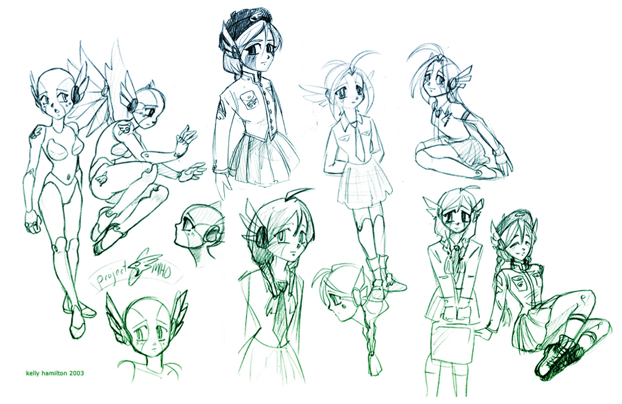 The military-inspired uniform makes its first appearance here and was used for her final design. This iconic ensemble would go on to be featured (more or less) in the revised game, despite the fact that most other character designs changed completely.
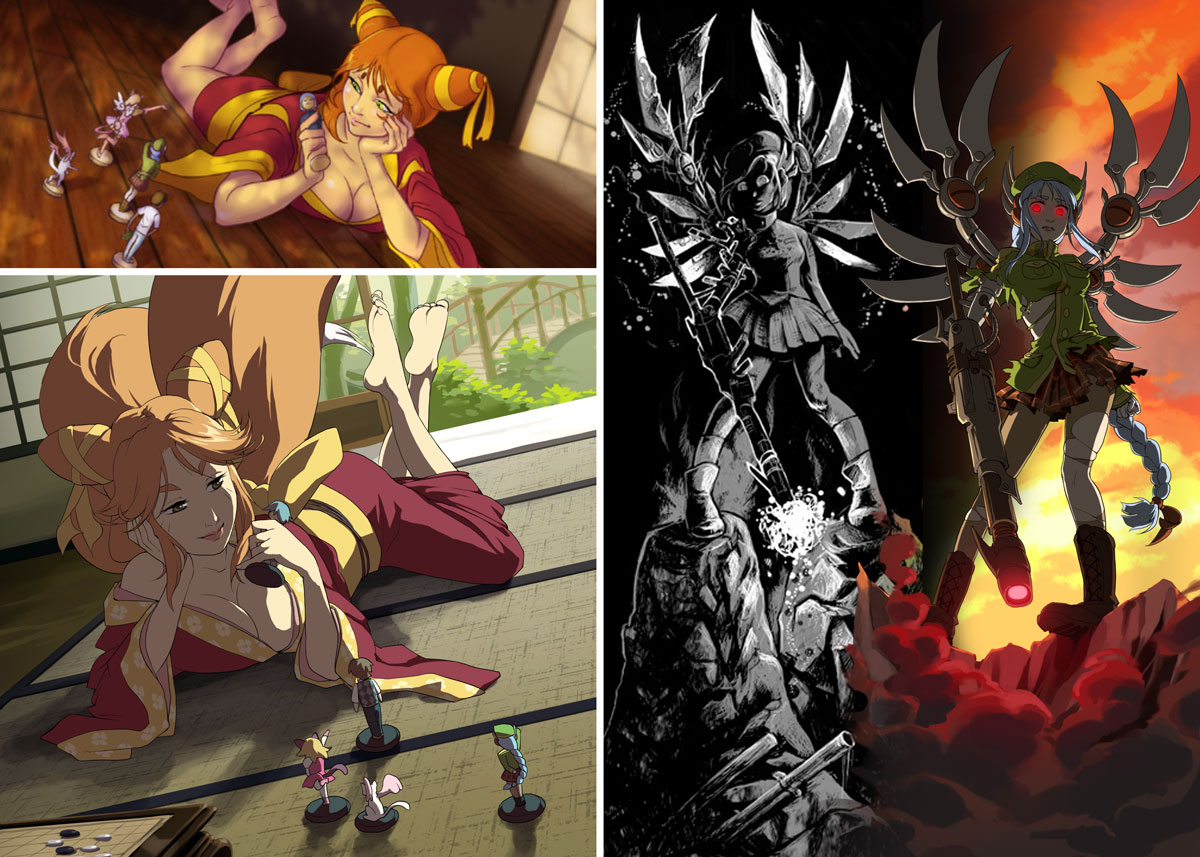 Oh, and if you’re wondering about my illustrations mentioned earlier, here’s a final comparison featuring everyone’s favorite copper, Jiro.
 Slight improvement, right?

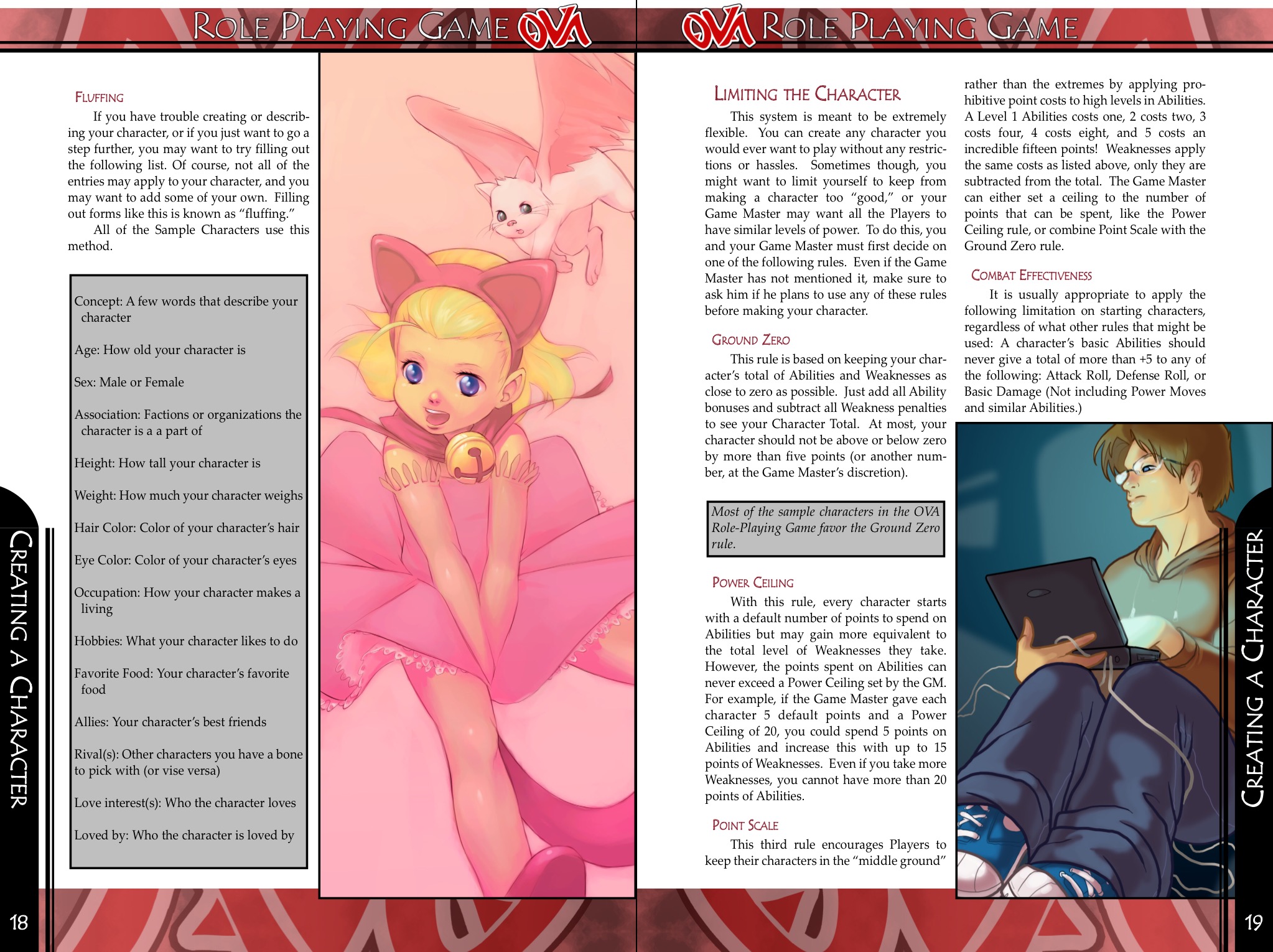
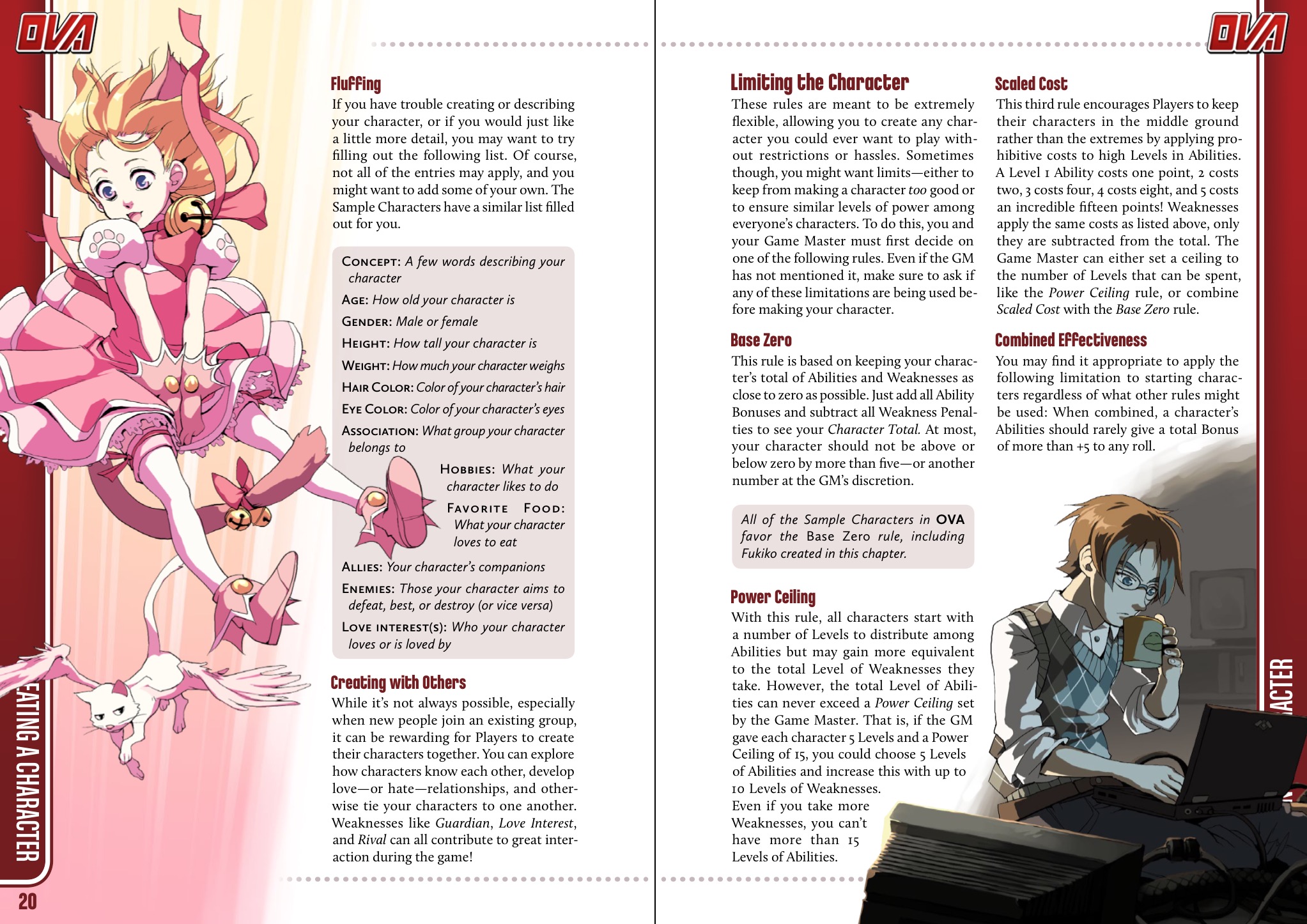 I chose this set of pages because it’s one of the few spreads that remained effectively identical between the versions with text and art placement. I think it demonstrates the difference a bit of experience makes pretty well! There are a lot of things I could point out, but here are some of the biggest points of advice I can share.
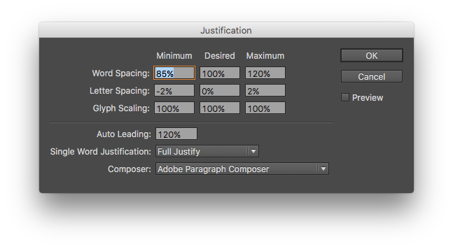


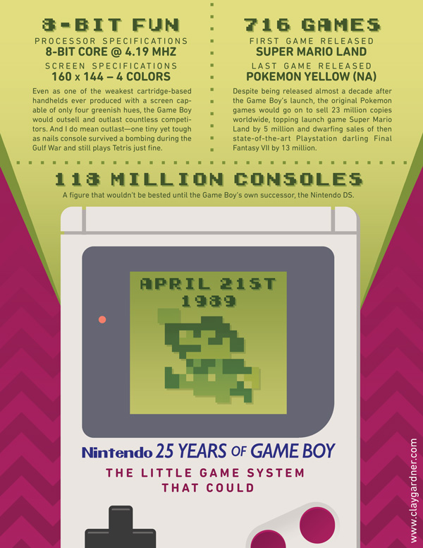 By the way, if anyone’s curious what font Nintendo used for the Game Boy logo, it’s Gill Sans. I also used a font called