Being a game about anime, art was always an important facet of OVA to me. When I made the original book, I did my best to overcome my inexperience and lack of budget to fill it with illustrations that appealed to the Japanese conventions I admired. I enlisted the help of numerous artists, among them friends, acquaintances, and complete strangers in the quest to illustrate my first RPG. And when there was no one else, I even took to illustrating a few pictures myself.
But I wanted more than just random pieces of art featuring equally random saucer-eyed teenagers, presented to the reader without context. I wanted to create a cast of characters, an entourage of affable faces that exhibited the tropes and themes that resonated with anime fans and could be recognized from page to page. They were like friends, helpful guides that would make that one special power or rules concept something tangible. You can see it in action and know how it works because, hey, that character uses it!
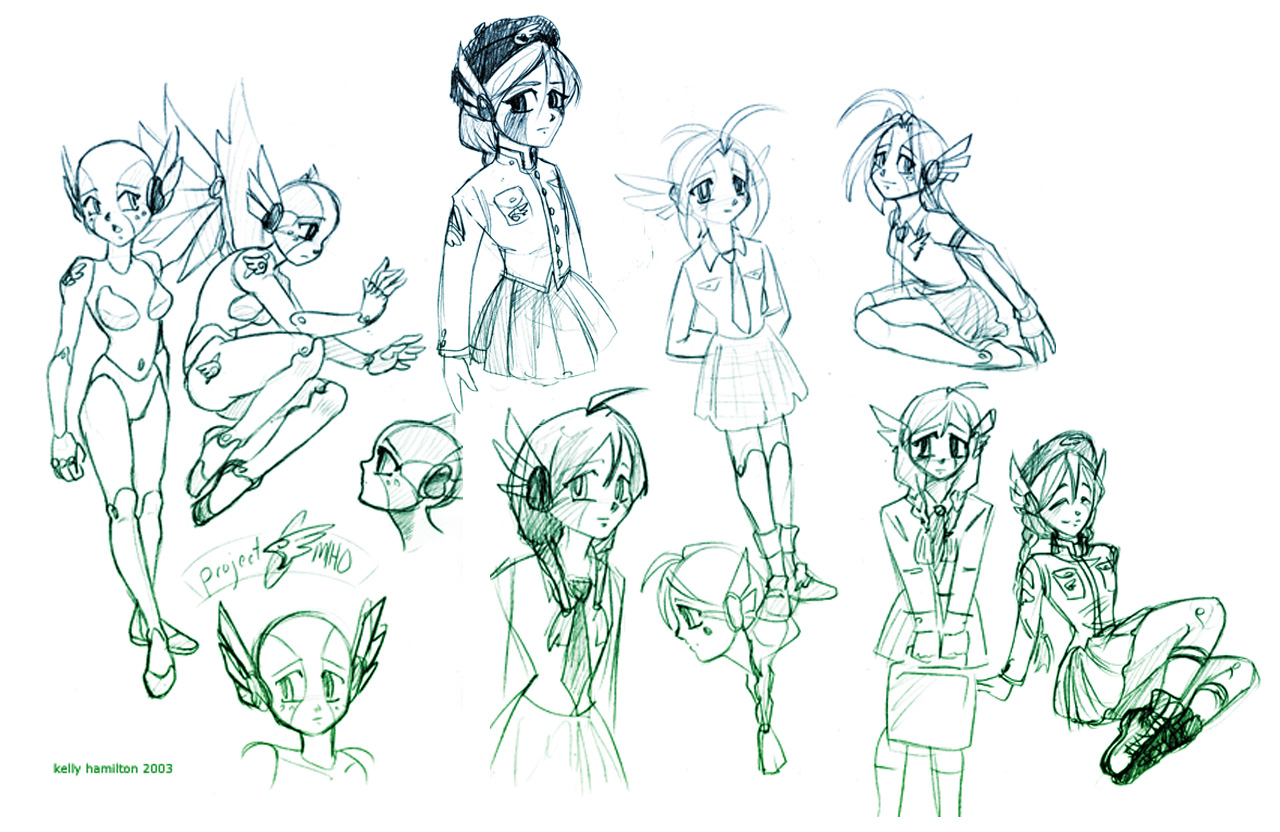
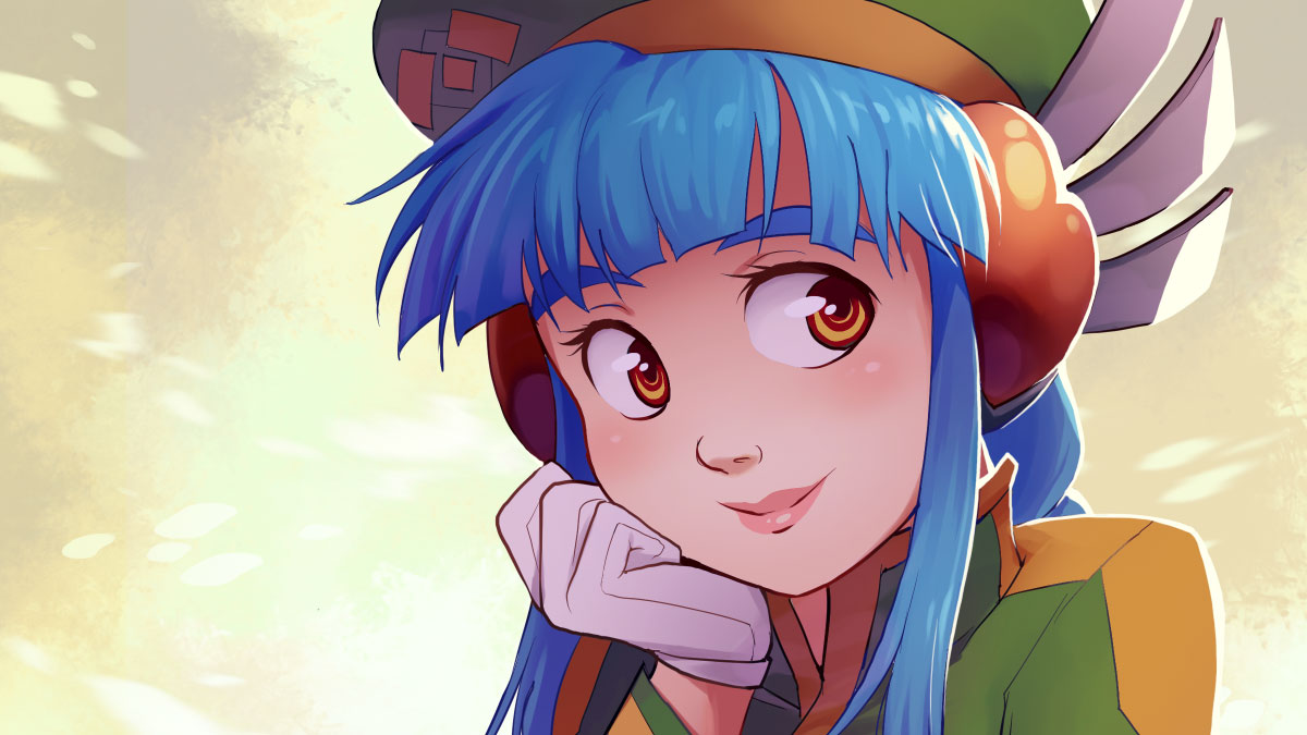
To this end, the first character I created for OVA was everyone’s favorite mechanical maiden with a human heart, Miho. She distilled everything I felt encompassed anime in one place, from her wild-colored hair, to the contrast of her robotic nature and human emotions, to—yes—a certain lack of aptitude in the culinary arts. Unsurprisingly, Miho is also the focus of some of the oldest art I have for the book. While her concept has always been more or less the same, you can see in Kelly Hamilton’s initial design sketches that she was once much more robotic than her final design!  The military-inspired uniform makes its first appearance here and was used for her final design. This iconic ensemble would go on to be featured (more or less) in the revised game, despite the fact that most other character designs changed completely.
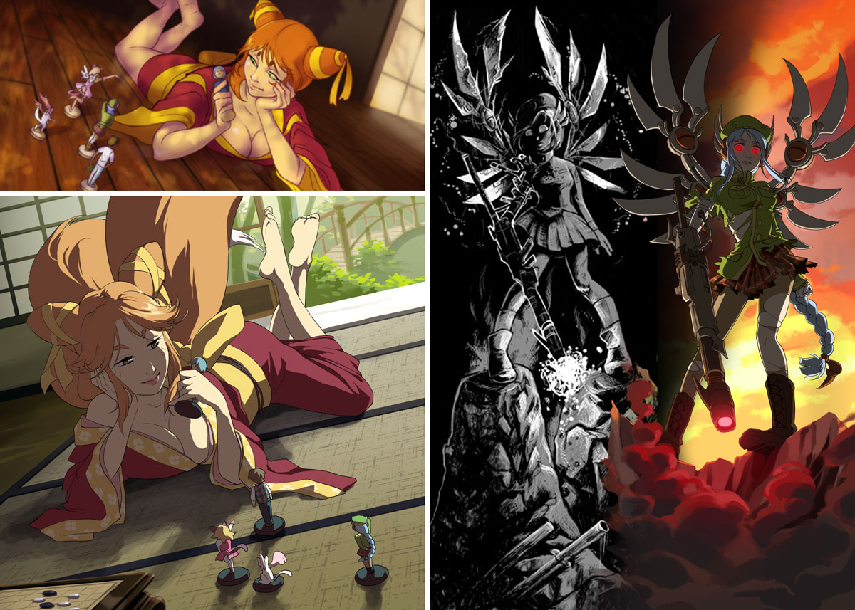
But with all the different artists, the original OVA was a bit scattered in terms of style. The second time around, I wanted OVA to have a cohesive look, to feel like a single anime series as it were. So I decided to have all the work done by one artist: Niko Geyer. If you’ve played a certain other anime role-playing game, you may recognize his work, but we’ve been friends for decades (even did a webcomic once upon a time). While many illustrations are brand new, quite a few favorites were remade.
 Oh, and if you’re wondering about my illustrations mentioned earlier, here’s a final comparison featuring everyone’s favorite copper, Jiro.
 Slight improvement, right?
So who is you favorite character from OVA? What about your favorite piece of art from the revised book? Feel free to click on this post and leave a comment below!

OVA has given me countless hours of enjoyment with my gaming group. For example, Shou and Auren became something far beyond what was presented in the book, and we ended up with a bevy of original characters that we all grew attached to.
I’m glad you made this game simple enough to be understood quickly yet versatile enough to be used for just about anything with sci-fi or fantasy elements.
I’m always happy to hear when people use the sample characters as starting points for their own stories and adventures. I did my best to make them that way, full of interesting details but still open for interpretation.
Likewise, making the game easy yet versatile was another goal of mine. It’s even on the back cover!
Some other Anime RPG? Niko Geyer’s name doesn’t appear in Tinker’s Damn, though!
Haha! Kidding aside, I always appreciated Tinker’s Damn for being a two-man effort. Actually, I pretty much have a soft spot for any RPG where one or two people field every position in the production of the book. Reminds me a little of my own efforts!
Tinker’s Damn serves to me as a reminder of how far technology and the means to self publish has advanced. They created the game during an era when the internet wasn’t populous, and print on demand technology wasn’t available.
I don’t think I could have done better given those circumstances, really.